A mobile fitness app empowering full-time remote workers to stay active, build healthy habits, and reclaim their well-being - without leaving home.
Timeline
2023
Role
UX Designer, UX Researcher
Team
- Classmates
Tools
Figma
context
My contributions spanned the full project: I led contextual inquiry interviews, synthesized research findings, and owned the high-fidelity visual design. This case study walks through every decision, dead-end, and breakthrough along the way.
For my UX Design Thinking class at the University of Washington, my team set out to tackle health and wellness through a human-centered design lens. What started as a broad prompt evolved into a focused, research-driven product: IMPACT - a mobile app built specifically for full-time remote employees who want to move more but keep running into the same invisible walls.
research
Understanding the Problem Space
Secondary Research
We started by grounding ourselves in existing research to identify known patterns before introducing our own assumptions.
Key findings from secondary research:
- Blurred work-life boundaries make it harder to carve out time for exercise. (Harvard Business Review)
- Prolonged sedentary behavior leads to serious health consequences including obesity, cardiovascular disease, and musculoskeletal problems. (World Health Organization)
- Remote workers struggle significantly more with maintaining motivation and accountability for exercise. (Journal of Occupational and Environmental Medicine)
Competitive Analysis
We audited the top fitness apps on the market - FitOn, Nike Training Club, and Strava - to understand what solutions already existed and where the gaps were.
The finding was striking: the market was oversaturated with apps competing on the exact same features - workout video libraries and activity tracking. Not one of them addressed the core friction points for remote workers: space constraints, motivation decay, or health literacy.
The question this raised for us:
If all these tools already exist - why are remote employees still struggling to work out at home?
Contextual Inquiry - Going Beyond the Survey
I knew surveys wouldn't give us what we needed. To truly understand our users, I led my team in conducting contextual inquiries with 4 full-time remote workers - a two-part method that combined traditional interviewing with real-time observation.
Part 1 - Conventional Interview
I developed and facilitated individual interviews to uncover each participant's relationship with exercise, their home environment, and what made staying active feel hard.
Key questions I used:
- Walk me through a typical day in your remote work life.
- Do you currently exercise? What does that look like?
- What gets in the way of working out when you're home all day?
- What would motivate you to move more?
Part 2 - Contextual Interview (Observation in Context)
In each session, I asked participants to walk me through their actual day in real time - not from memory, but as it happened. This gave me a window into behaviors people don't think to mention: the overflowing desk that doubles as a dining table, the apartment where the living room is also the "gym," the mid-afternoon slump that kills any intention of working out.
When I needed to clarify what I was seeing, I paused to confirm my interpretation rather than assume. This kept the data grounded in the user's reality, not my projections.
Click a thumbnail to open the viewer. Use the side arrows or your keyboard arrow keys to move between pages.
A Challenge I Navigated - Privacy in the Home
| Obstacle | Some participants were uncomfortable allowing observation inside their homes - a completely valid concern I hadn't fully anticipated. |
|---|---|
| How I resolved it | I reassured participants that all data would be anonymized and used solely for research. I gave them full control over which areas or activities they shared - turning the session into a collaboration rather than a surveillance exercise. This also deepened trust, which made the interviews richer. |
What We Learned - Research Findings
Four clear themes emerged from our interviews and observations:
Lack of Motivation
Even if the user begins their fitness journey, motivation would decline with little to no means of raising it up again over time.
Limited Space
Living in small spaces can be difficult for people to exercise without having to go to an outside space such as a park or the gym.
Time Management
Many participants expressed challenges in effectively managing their time while working remotely.
Need for Education and Awareness
Participants emphasized the need for easily accessible information on the health risks of a sedentary lifestyle.
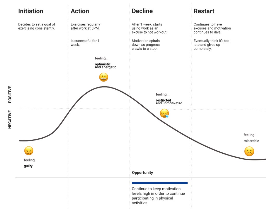
The key insight:
Most users weren't inactive by choice - they were active starters who hit a motivation cliff and had no tools to climb back up. The opportunity wasn't to get people started; it was to keep them going.
To make this tangible, I mapped a mini user journey tracing the emotional arc from initial motivation → routine establishment → motivation decline → dropout. This became our north star for identifying intervention points in the design.
goals
How might we design a solution that consistently boosts motivation and provides accessible resources for full-time remote employees?
Revisiting our competitive analysis through the lens of our research made the opportunity undeniable: no existing app addressed motivation sustainment, space-adaptive workouts, or health education in an integrated way. The market was full of tools for people who were already motivated - nothing existed for the moment the motivation runs dry.
User Personas
I synthesized our research into two personas that anchored all future design decisions - not as hypothetical users, but as distilled portraits of the real people we interviewed.
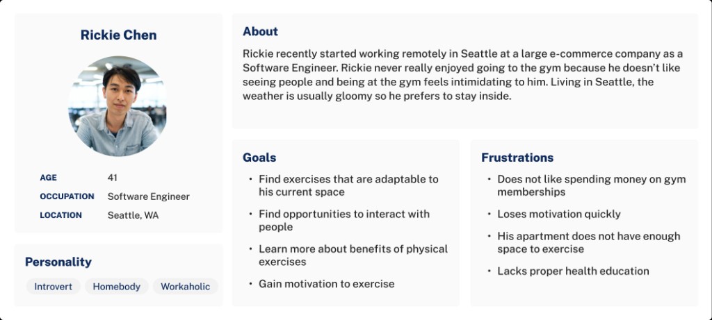
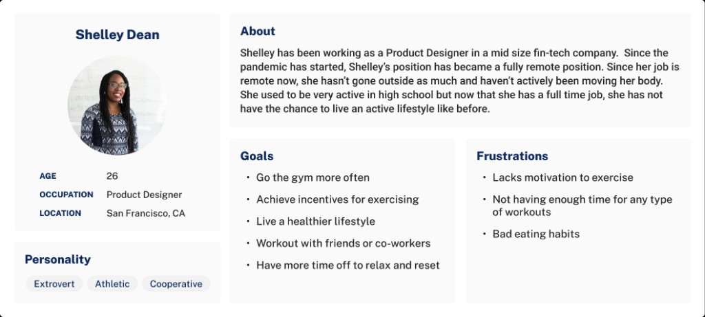
These personas kept the team grounded during ideation: every feature we considered had to serve Rickie or Shelley, not a generic 'fitness app user.'
ideation
Ideation, votes, and three pathways forward
We generated many ideas for a motivational experience, voted as a team, and plotted ideas by implementation effort against our goals. A mobile app emerged as the strongest way to cover motivation, accessibility, and education together.
Low-fi wireframes mapped three straightforward paths toward those goals.
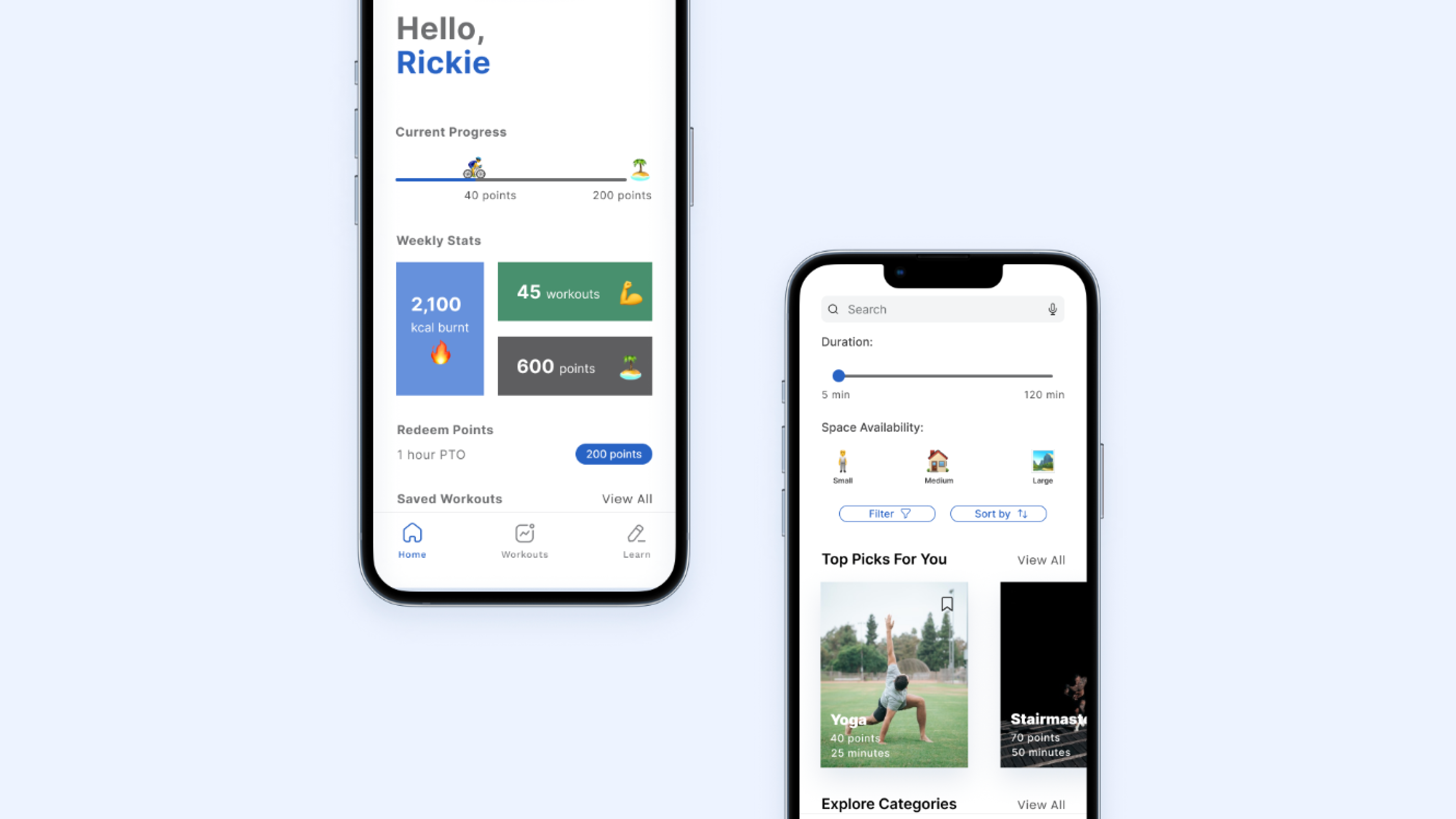
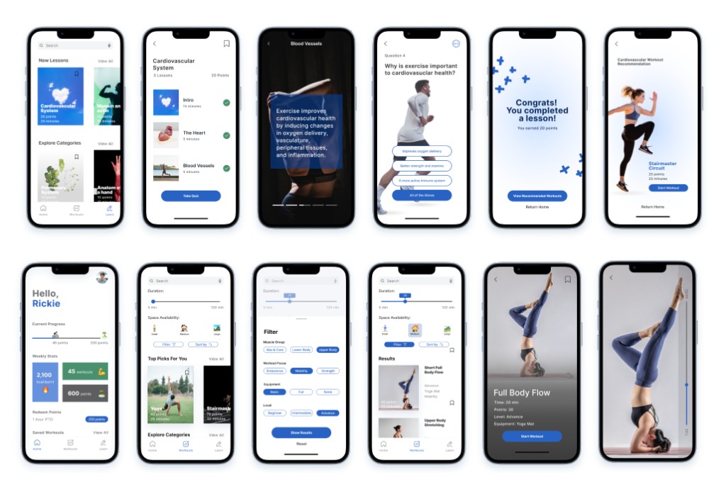
- Learning pathway - modules and quizzes on health and fitness; completing modules earns PTO-style points.
- Exercise pathway - workout videos with filters for available space and time; points scale with workout intensity.
- Reward pathway - progress toward PTO rewards, weekly points, and a company-wide leaderboard to reinforce habit.
testing
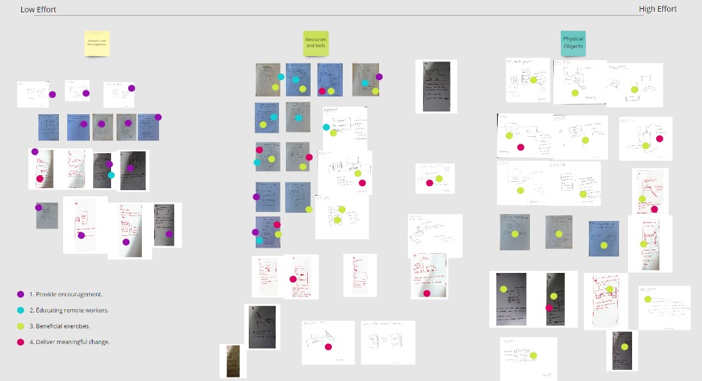
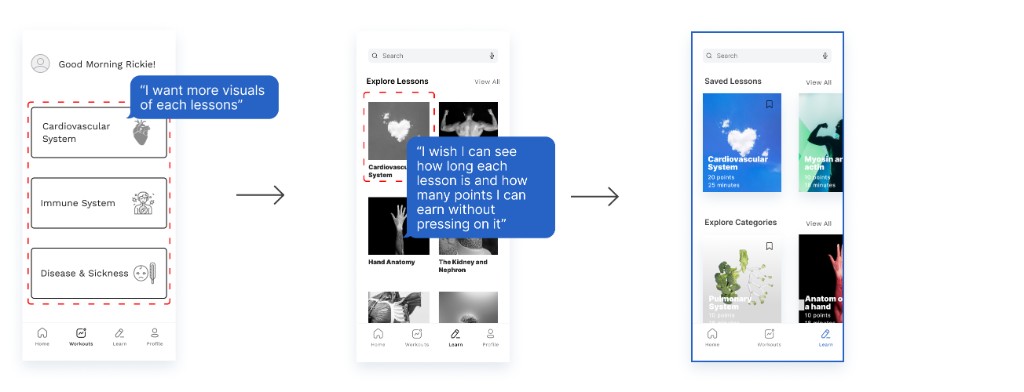
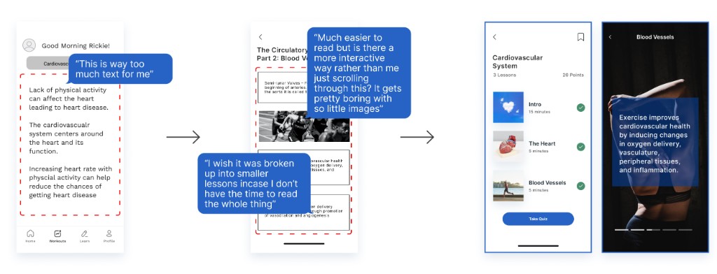
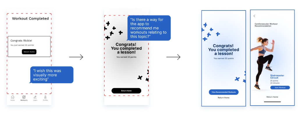
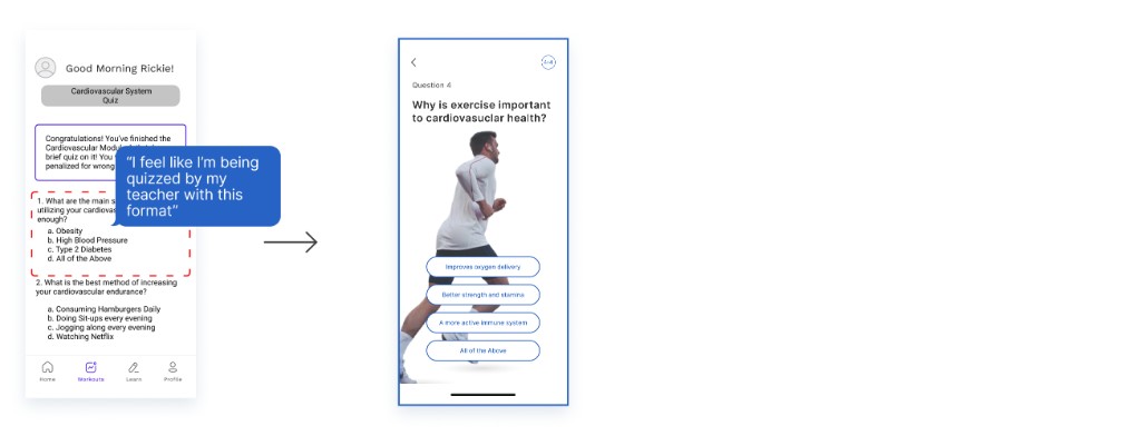
Usability Testing - 3 Rounds of Iteration
We ran moderated think-aloud testing over Zoom with 5 participants across each round, including remote employees, peers, instructors, and TAs. Participants were asked to complete learning modules, find a suitable workout, and track their progress while narrating their experience aloud.
This process was humbling and essential. Here's what we found and how we responded:
product
Accessible UI and the final experience
reflection
What I Learned and next steps
This project reinforced something I now hold as a core design principle: the best insights don't come from surveys - they come from watching people in their actual environment. The contextual inquiry sessions were the most valuable 2 hours of the entire project. Seeing someone's cluttered apartment or hearing them laugh nervously about their "workout corner" told me more than any questionnaire ever could.
Three rounds of usability testing also made the iterative process visceral. Watching users struggle with a filter button I thought was obvious, then redesigning it, then watching the next user breeze right through - that feedback loop is where design actually happens.
Working within a team taught me the value of friction. Diverse perspectives slowed us down in the best way - they forced us to pressure-test assumptions and reach better solutions than any of us would have alone.
If I Had More Time
- Conduct additional usability testing with a larger and more demographically diverse participant group.
- Refine micro-interactions and animation to make the reward system feel more satisfying and polished.
- Validate the PTO reward mechanic with real employer stakeholders to assess feasibility as a workplace wellness program.
Planned Next Steps
- Inclusivity. Design alternative exercise pathways for users with physical disabilities or mobility limitations.
- Professional Partnerships. Partner with certified fitness trainers and health professionals to create medically-informed workout recommendations based on individual health profiles.
- Richer Multimedia Content. Explore richer multimedia formats: video demonstrations, interactive body-weight calculators, and audio-guided workouts to serve diverse learning styles.
more info
Want to hear more about this project or how I work? I'm happy to chat :) reach out at oliviakttran@gmail.com.